Personal Blogging Platform 🔗
📌 Where It Started
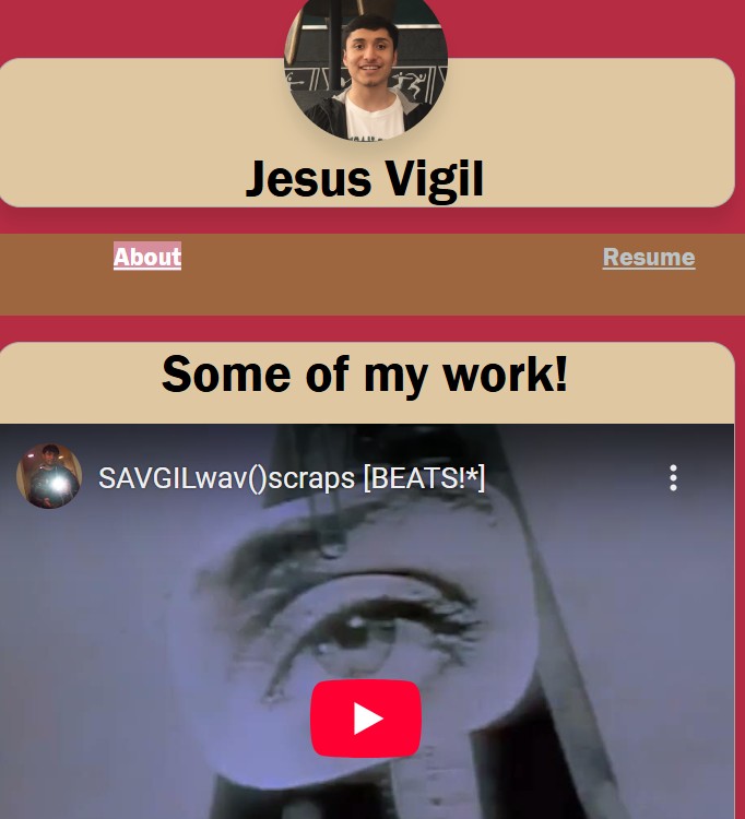
I knew exactly what I wanted—a personal hub for everything I do creatively. A place where I could showcase my music, my merch, my inspirations, and make it feel alive, not just another static webpage.But the execution? Yeah, it wasn’t there. I threw together basic HTML and CSS, no JavaScript, no real structure—just whatever I could piece together at the time. It worked, technically, but it was primitive. Navigating it felt rigid, slow, and frustrating, because I didn’t yet have the knowledge or tools to bring it to life the way I imagined.
💡 What I Got Right, Even With Limited Skills
Even though the project wasn’t exactly what I wanted, there were still elements worth keeping. The embedded video and music links were a step in the right direction—at the very least, they put my content front and center, even if the presentation lacked refinement. The execution might not have been polished, but the intent was always clear: make my work easily accessible and create a space where everything I produce has a proper place.
Navigation, though far from intuitive, did what it needed to do. It wasn’t elegant, it wasn’t fluid, but it worked. People could move around, find things, and explore different sections of the site, even if the experience felt clunky. Looking back, I can see where it needed serious restructuring, but at the time, simply having functional pathways to my content felt like an achievement.
One of the stronger aspects was the card-based UI. I instinctively built elements in a way that could be expanded later, even though I didn’t yet have the means or knowledge to push it further. The idea of modularity was there, just waiting for the right tools and approach to unlock its full potential. Now that I know how to properly structure layouts and create interactive, scalable designs, I can take that concept and execute it the way I originally envisioned.
I also made an effort to incorporate hover effects and GIFs to add interactivity and engagement. It was a small touch, but an important one—I wanted the experience to feel dynamic, to have movement, even if the underlying framework wasn’t strong enough to support the level of immersion I was aiming for. The ideas were solid, just held back by the limitations of my technical skills at the time.
Now that I know how to build properly, the foundation I laid back then can actually evolve into something functional, immersive, and intentional. The vision was always there; I just didn’t have the tools to make it happen the way I wanted. But that’s changed now, and the next iteration is going to be exactly what it should have been from the start.
🚀 What Held Me Back
I knew exactly where this project could go, but I just didn’t have the expertise at the time to make it happen the way I envisioned. The biggest limitation was the lack of JavaScript or dynamic logic—without React, Next.js, or even basic JS, everything was completely static. There were no smooth interactions, no real-time content updates, and none of the polished UI functionality that would’ve made the experience truly immersive. It was a page that displayed content, nothing more, and that wasn’t nearly enough to capture the creative energy I wanted it to reflect.
On top of that, the entire development process was painfully inefficient. I spent far too much time stuck in trial-and-error, manually tweaking things just to make simple adjustments work. Every broken layout, every misplaced element, every weird styling issue had to be fixed one by one, without any streamlined workflow to guide me. It was slow, frustrating, and made even minor changes feel like a massive undertaking—something that modern tools would’ve solved instantly.
The navigation and layout scaling were another huge weakness. The site wasn’t built with responsiveness in mind, so it didn’t adjust well across different devices. Elements felt clunky, rigid, and anything but intuitive. It wasn’t engaging, it wasn’t fluid—it was just frustrating. Instead of guiding users through my work in a way that felt natural, it created unnecessary roadblocks, making it harder to explore rather than inviting curiosity.
The biggest structural flaw, though, was the lack of any backend. Everything was hardcoded—every music link, every merch listing, every detail manually placed without any dynamic functionality. That meant no custom music player, no organized merch system, and absolutely no scalability. If I wanted to add something new or modify an existing section, I had to go in and manually update everything, which made the whole project feel impractical to maintain.
All of this held the portfolio back from being what I knew it could be. The ideas were there—the vision was solid—but I didn’t yet have the technical foundation to execute them properly. Now, with everything I’ve learned, I can take those core concepts and actually build them the way they were meant to be, without running into the same frustrating limitations.
🧐🔥 What I Can Make Now
I’m not that person anymore. Now, I have the technical skillset to build this properly—to take the raw vision I had back then and fully execute it with the best tools available. The scattered ideas and half-baked execution from before can finally evolve into something structured, functional, and immersive, exactly as I imagined it.
A fully immersive dashboard is the foundation. Inspired by the Xbox 360 interface, it will feature hover effects, animated transitions, and depth-layered UI, making navigation feel fluid and engaging rather than static and rigid. No more basic layouts—this will be an interactive space where movement and responsiveness drive the user experience.
A personal streaming hub replaces outdated embeds. Instead of throwing in external links, I’ll build a custom media player—waveform visualization, track history, and real-time updates that let people actually interact with my work rather than just passively scrolling past it. This turns my portfolio into a living platform, where music and videos feel central rather than secondary.
A modern merch store completes the experience. No more simple images and links—this time, it’s interactive product displays, Stripe integration, and real-time inventory updates, ensuring everything functions like an actual professional storefront rather than a placeholder idea. Visitors won’t just see what I create—they’ll have the ability to support it directly through a seamless shopping experience.
A modular UI makes expansion effortless. Instead of rigid layouts, each section will be built to evolve, meaning I can expand and refine the site over time instead of feeling locked into a static version. Whether it’s adding new projects, shifting design elements, or incorporating emerging ideas, scalability will finally be on my side.
Optimized performance and modern functionality tie everything together. No more slow, painstaking trial-and-error—Next.js, TailwindCSS, Framer Motion, and server-side rendering will ensure smooth animations, instant load speeds, and intelligent caching so the experience feels polished and effortless. It’ll be fast, responsive, and immersive, with every element built intentionally rather than hastily patched together.
🏆 The Final Goal: Bringing My Vision to Life
This isn’t just a portfolio anymore—it’s a space that truly represents me and everything I create. It’s no longer just a collection of projects; it’s a living, evolving hub, built with intentional design, interactivity, and modern development practices to fully showcase my work.
This site will adapt and grow with me, expanding as my creative journey evolves rather than staying static. Instead of feeling like a set-in-stone project, it will become a dynamic space, allowing me to refine, enhance, and add new ideas over time without limitations.
It will also serve as a hub where fans and supporters can truly engage with my music, merch, and projects. Instead of being just another portfolio, it will invite participation, offering a personal marketplace, streaming hub, and creative showcase, giving people a direct way to experience and support my work.
At the core of it all will be a fully immersive dashboard, where every element is built for interaction, not just display. The experience will feel fluid, engaging, and intuitive, designed to reflect the artistry behind my work rather than just a place to click through projects.
🔥 This time, it’s exactly what I envisioned—not just a portfolio, but a fully realized creative universe. Next step? Execution! And this time, I have everything I need to make it happen. Let’s build. 🏗️